Wichtig – im Video bei ca. 13:30: Der DIV, in dem das sticky-Element sitzt, muß genauso lang sein, wie der lange DIV auf der anderen Seite. Also muß der MAIN-Div mit „stretch“ versehen werden.
Bei Mobile ist sticky ausgeschaltet, weil es nur noch eine Spalte gibt.
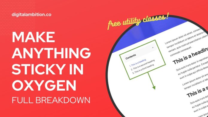
Copy and paste these utility classes into an Oxygen stylesheet. Once you’ve used them once on an element they’ll start to show up in the recommended classes panel. (Add Selector + Name der Class = dann kommt die Class in der Auswahl für die verfügbaren Classes)
/* STICKY UTILITY CLASSES */

.sticky {
	position: sticky;
	top: 0;
}

@media (max-width: 479px) {
	.sticky-off--s {
		position: static;
	}
}

@media (max-width: 767px) {
	.sticky-off--m {
		position: static;
	}
}

@media (max-width: 991px) {
	.sticky-off--l {
		position: static;
	}
}

.sticky-top--s {
	top: 2.5%;
}

.sticky-top--m {
	top: 5%;
}

.sticky-top--l {
	top: 10%;
}
The main „.sticky“ class needs to be applied to any element that you want to be sticky. After that you can add the modifier classes. For example, if you need a bigger gap between the sticky element and the top of the browser window you can add the „.sticky-top–m“ class for a 5% gap.
The „off–“ classes will turn sticky off at their respective breakpoints. This typically isn’t needed but there’s a small number of use cases where you might need to do this.
Note: If you structure the page incorrectly, sticky either won’t work or will have undesirable effects. Make sure you watch the part of the tutorial where I talk about page structure. Spalte, in der der „sticky Container“ ist, muss genauso hoch sein, wie der „Haupt-Container“.