
Man kann sich den CSS-Code für das Dreieck online generieren lassen:
Clippy – CSS clip-path maker von bennettfeely.com macht´s möglich:
The clip-path property allows you to make complex shapes in CSS by clipping an element to a basic shape (circle, ellipse, polygon, or inset), or to an SVG source.
CSS Animations and transitions are possible with two or more clip-path shapes with the same number of points.
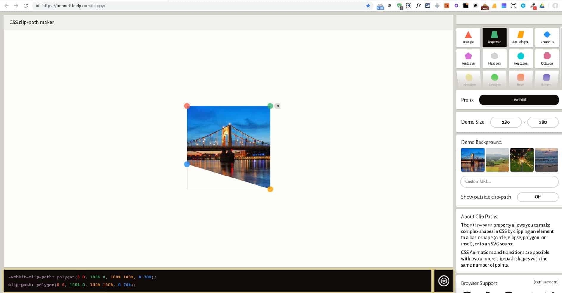
Man erstellt einen Trapezausschnitt und bekommt dafür den CSS-Code geliefert. Der Ausschnitt lässt sich beliebig per Drag-n-Drop anpassen.
Beispiel: Dreieck links
-webkit-clip-path: polygon(0 0, 100% 0, 100% 100%, 0 70%);clip-path: polygon(0 0, 100% 0, 100% 100%, 0 70%);
oder Dreieck rechts
-webkit-clip-path: polygon(0 0, 100% 0, 100% 70%, 0 100%);clip-path: polygon(0 0, 100% 0, 100% 70%, 0 100%);
Den Code fügt man in Oxygen in den entsprechenden DIV über Advanced > Custom CSS ein.

So lassen sich auch noch andere abgefahrene Grafiken erstellen: